Here at McCormick Paints, we believe in the power of color. It’s well known that color affects mood and psychology, but did you know that it has a tangible effect on the value of a property? Research shows that the return on investment (ROI) for exterior painting is 55% while the ROI for interior paint jobs climbs all the way to 107%. This is why we prioritize color. As proud members of The Color Guild, we’re taking color choice to the next level.
McCormick Paints is revolutionizing the color-picking process. Through our extensive set of color solutions, home builders, property managers and residential painters finally have powerful tools at their fingertips to make the best decisions. Color is a way to express feelings and inspirations while manifesting beauty, and our technological advances make it easier than ever to bring your vision to life.

McCormick Paints Color Tools
Our tools help you pick out the best colors to improve curb appeal or spruce up interiors. Examples include:
- Color chips: If there are a few colors that you find on our website and want to see them on printed 3×4.25-inch color chips, we will happily mail them to you immediately. These are great for designers to produce custom color schemes that can then be visualized on location. Hold up our chips to the area you’re looking to paint and imagine it covering the entire surface. It works extremely well. If you don’t want to wait for them to be mailed, color chips are available at every one of our in-store locations. Please visit our website to find the store nearest you.
- Architectural kits: These are mainstays in the field of architecture for a reason. There’s nothing quite like seeing real paint on a real surface, so these kits are valuable for accurately replicating what you can see on a property. They make for exceptional show pieces for presentations or pitches because there is very little abstraction. The audience can reach out and touch the future, which can go a long way in selling a vision.
- Fan decks: Spread out dozens of potential color choices before your eyes. We have many different options for palettes based on different design philosophies. Are you looking for earth tones? Neutrals? Vibrant, bold hues for accent pieces? There are decks for everything and having them right in front of you on printed sheets ensures color accuracy.
- Color Visualizer: Our innovative tool allows you to see how hundreds of different colors will look in various situations. There are options for residential homes, commercial properties, interiors and exteriors. Choose from a variety of home and room types. If you want to go further, you can even upload your own images to be manipulated. A few simple clicks later and you can see how different colors will look on the exact interiors or exteriors you want to paint. You can choose how multiple features, including floors, individual walls and exterior pieces are colored. This is an amazing and interactive way to inform color decisions.
- Drawdowns: These are actual paint samples, rather that just a color sample. It takes into account the sheen level and inherent properties of the paint to craft a more accurate color estimation. A metal bar is used to spread the paint so there are no brushstrokes, and evenness is assured. Drawdowns are a significantly better approximation of how the paint will look and are a fantastic tool for architects and designers.
- Sample programs: While drawdowns are nice, paint samples are the best way to ensure complete color accuracy. You’re getting the exact paint you’re considering, so if you test them on the material you wish to paint, it will give you the clearest picture possible. Our samples are an affordable one quart.
Choose from more than 1,300 possible colors or create a custom one if nothing strikes your fancy. If you purchase three samples, you’ll receive a free sample kit that includes a two-gallon bucket, three-inch wooster roller and tray, 9×12-foot plastic drop cloth, a two-inch foam brush and a can opener. We love to make getting the perfect color palette as easy as possible.
 Color consultations
We staff color experts who want to help guide you through the process of selecting the right colors. Our professionals are available for personalized advice and on-site walkthroughs. Through their help, you can choose the best colors that set the right mood for any given area. Architects, property managers, designers, commercial builders, contractors, developers and owners alike can seek our advice for any situation.
Contact a color expert today and let us steer you in the right direction. Our team can help you with things such as:
- Color schemes: Don’t worry if you’re not an expert on color theory. We can help you choose pleasant complementary or bold contrast color schemes that evoke the emotions you want to cultivate.
- Design boards: We’re ready to guide you through even the very first steps of selecting your colors. Design boards incorporate imagery that features colors you like and aids with choosing your palette. With a design board in hand, you can better decide which colors will be prominent and which will be secondary. This makes the entire process run smoothly.
- Accent color boards: After you select your main palette, we can help you choose accent colors that highlight specific areas. This adds some necessary pop to your scheme and prevents everything from looking too similar. A nicely placed accent wall, for instance, can be the centerpiece of your entire scheme. We ensure you accomplish your color goals.
- Painter referrals: Throughout our nearly six decades of operation, we’ve built solid relationships with a network of trusted painting professionals. We know it can be difficult to find reliable crews that get the job done correctly and on time, so we’re happy to help.
Our new image rendering platform

The next step in our continuing quest to provide fantastic service is the unveiling of our new image rendering platform. This is the best way to try out your color ideas and see how they look in real world situations. Our award-winning team can advise on color choices as well as teach you how to use the program so that you can tinker as much as you want.
Usually, getting renderings means hiring an expensive designer to create your ideas in 3D. Prices for that kind of work can be thousands of dollars, depending on your specific needs. With our software that expense is eliminated, and you get a much more interactive experience.
There is no back-and-forth with designers going over color concerns. You can easily change colors with the click of a button. Compare and contrast different looks until you find exactly what you want. We’re driving the industry forward by offering such useful, technologically advanced tools.

Advice to get you started
Now that you’re aware of all of the tools and services we provide, I’d like to hand out some general advice for those in the early stages of site planning. If anything inspires you, and you’d like a second opinion on your thoughts from an expert, don’t hesitate to reach out.
Interiors
One important aspect to consider when dealing with interior painting is what sheen level you’d like for which rooms. Here are some of our basic recommendations:
- High gloss: This type of paint is extremely reflective and shiny. It’s very durable and good for trim around doors and windows. In most situations, high gloss paint will be too reflective for full interior walls, however, so we wouldn’t recommend painting the living room with it.
- Semi-gloss: Less reflective than high gloss, but still pretty shiny. This paint is good for trim as well, but can also be used for high-traffic, smaller rooms such as kitchens and bathrooms. It promotes a new, clean feeling that suits these areas well.
One thing to look out for is ensuring the walls are smooth and free of things such as nail bumps before application. The glossier paints won’t hide these imperfections well, and you’ll have to find other ways to hide them. Otherwise, it’s a durable option that would do well in a child’s bedroom or playroom.
- Satin: Satin sheen still has a good amount of shine to it but is matte enough to be good for full rooms. Its velvety finish is easy on the eyes, and it is durable enough for busy areas such as foyers and hallways. More preparation is needed before application, however, since it also shows imperfections and brush strokes.
- Eggshell: Now, we’re getting to the flatter end of the reflective scale. Named after the more matte appearance of eggshells, this kind of paint is good for larger, more prominent rooms. Eggshell finishes handle light well and promote a calmer, more serene vibe. Try it out for dining and family rooms.
- Flat: The most matte option available that soaks up light. It provides the most coverage but is slightly more difficult to clean. It’s a better choice for adult bedrooms or other areas that won’t see much heavy traffic.
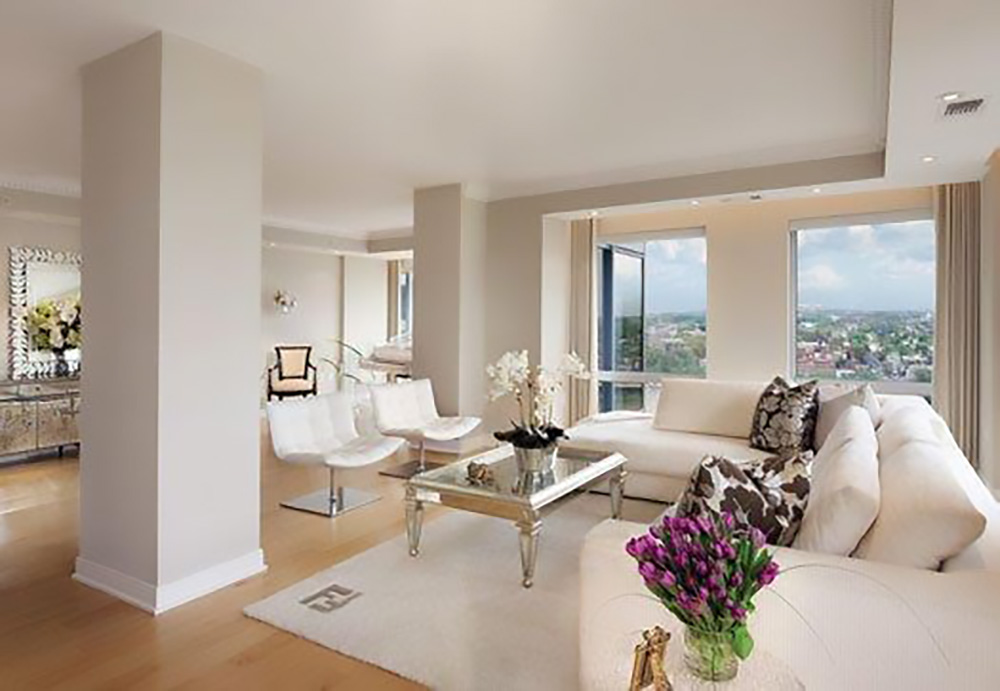
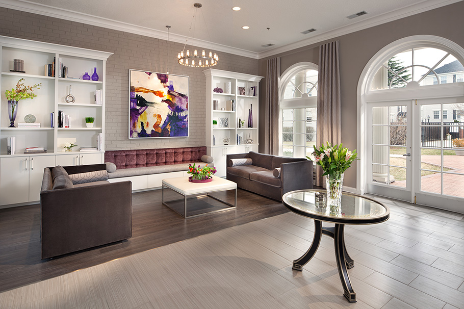
Once you’ve figured out what sheen level you’d like in each room, construct your color palette and get samples to see how your colors react to the sheen and materials you’re painting on. Interiors love warm, neutral palettes. They are inviting, pleasant colors that provide versatility.
Potential buyers can picture their belongings in the rooms without being distracted by audacious, attention-grabbing hues. Lighter shades are fantastic in most rooms and make the area look brighter and more appealing. But, if you want a large, open room to appear a bit more cozy, you can go with a darker shade on one or more of the walls. You want buyers to feel at home while offering the chance for customization, and light neutral colors are the closest thing to a blank canvas you can provide.
Bright whites can oftentimes feel too industrial and harsh, so plan according to what kind of property you’re trying to sell. White walls may work in some commercial and office settings, but they won’t be as appealing for those looking for a new place to live.
Exteriors
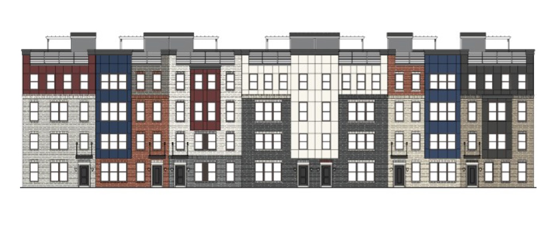
A good color scheme for your exterior improves curb appeal and makes the best first impression. We recommend only using three colors and, if in doubt, follow the 60-30-10 percentage rule. This simply means that the majority (60%) of your house should be a single color with trim and garage doors (30%) being another complementary color and the last 10% providing a contrast pop.

The contrast color can go on accent pieces such as shutters to up the wow factor. Exterior paints come in the same sheen levels as interior paints, and we recommend higher gloss varieties for trim. Unless the market you’re wanting to capture is very specific, we recommend going with neutral colors. Wild color choices might look great to you, but you should want to cast the widest net possible for potential buyers.
The McCormick Paints difference
We’ve been in the paint business for almost 60 years and operate 28 stores throughout Maryland, Virginia, Delaware and Washington, D.C. Ask the pros in the Mid-Atlantic region what paint they use, and they’ll tell you our products are second to none. Our commitment to quality and service shows with every brush stroke on the wall.
If you have any questions regarding our products or color tools, contact us today and talk with one of our knowledgeable, friendly representatives. We’re here to bring your vision to life and add value to your property. Don’t settle for anything less and you’re sure to find success.

 Color consultations