With vacation season ending, and back to school around the corner, this month’s palette explores colors for educational environments. Focusing on preschool and elementary school spaces, a palette of primary and secondary colors is our choice.
Bold and confident, a blue, yellow, red and green are grounded by an easy neutral hue. This functional palette is perfect for promoting playfulness, positivity and stimulation.
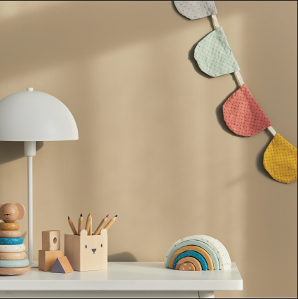
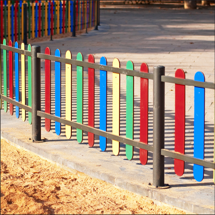

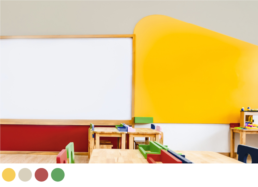
Ideal for preschool and elementary school classrooms, create an encouraging learning environment with bold color. Using a color-blocking technique, natural Pebblebrook is combined with primaries, Dandy Lion and Empower for classroom walls and wooden chairs and desk tidies are painted in Aqueous, Florida Waters and Empower to enhance this fun and positive mood.
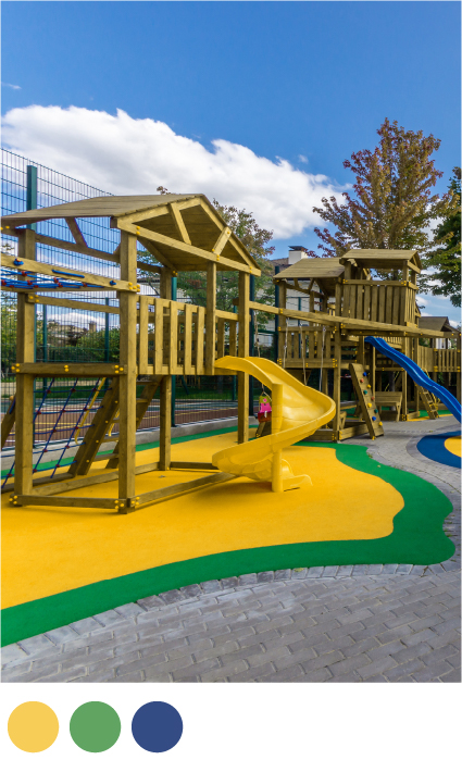
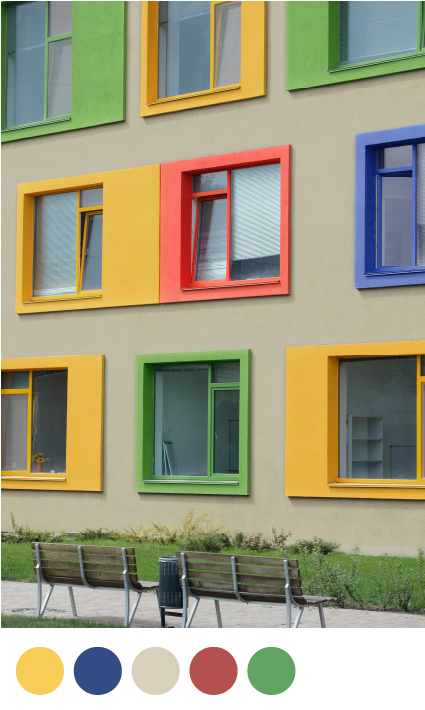
For an instantly welcoming and cheerful appearance, why not invest in bold color schemes for educational exteriors and child-friendly environments? Play areas are given a colorful makeover with path-finding shapes in Dandy Lion, Florida Waters and Aqueous.
Here, the palette is used to transform a school’s façade. Neutral Pebblebrook is used as a base with eye-catching window frames in the palette’s primary and secondary hues.
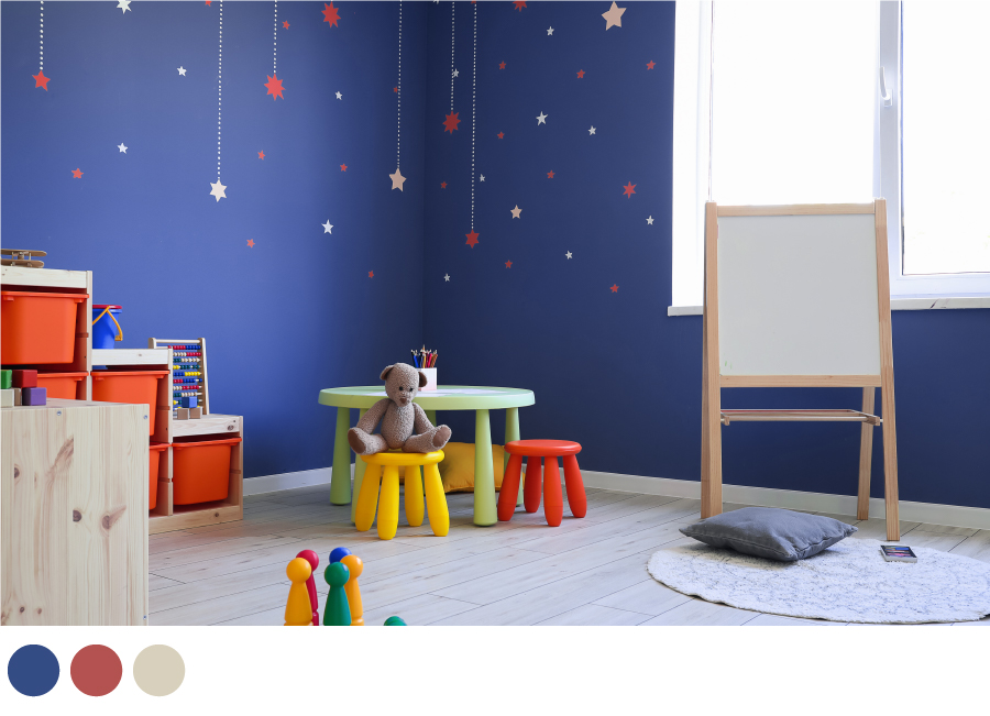
For those looking to home-school this academic year, creating a designated area for your little ones to learn and have fun in is a great way to help with work-life balance. Playful wall murals are also a brilliant way to enhance creativity. Use true blue, Florida Waters as your key paint color and create a starry-night theme with stenciled stars in Primary red, Empower and neutral Pebblebrook.
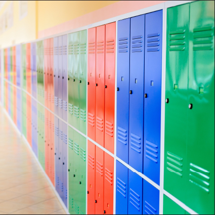
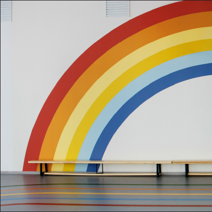
School corridors are given a colorful update with walls in cheerful yellow and lockers in a combination of bold blue, red and green. Sports halls can also benefit from this color-confident palette through painted wall murals. This not only offsets an uninspiring white wall, but can also be a creative activity to involve the students in. So, this August let our inspiring color tips support you in making interior paint choices to enhance children’s engagement and mood in the classroom and beyond.
In our next article we will explore the timeless beauty of neutrals for the home.
Color Guild look to Colour Hive, the international trend forecasting company, and publisher of MIX Magazine for interior decorating advice and ideas. Colour Hive has a track record of accurate color trend information and successful forecasts for the interior and contract markets worldwide.
#colortrends #colorfocus #colorinspo #contractinteriors #colorsforeducation #ColorGuild #interiors #exteriors #schoolinteriors #kindergarteninteriors #nurseryinteriors #paint #August2021 #2021colortrends #school #education #summer #brightcolors #2021 #primarycolors #blue #green #neutrals #red #yellow #COTY2021 #Secondarycolors #DandyLion #FloridaWaters #painttrends #colortrends #Pebblebrook #Empower #Aqueous
