The Pro Color Palette 2026 was designed with architects, specifiers, and professional contractors in mind — a forward-looking palette that reflects the environments where we live, work, and gather . Each group of colors highlights the evolving role of design in wellness, healthcare, residential, hospitality, education, and workplace spaces, offering clarity, warmth, and purpose.
Wellness
As wellness destinations become more central to modern lifestyles, spa interiors are evolving as spaces of restorative escape from the pressures of daily life. This palette offers a perfect balance of clarity and comfort through gentle contrasts and natural warmth.
A duo of yellow-greens Motherland and Whitewash introduce freshness, while Baguette and Green Gold offer anchoring neutrality. Yellow Gold Strand and peach Mellow Glow lift the palette with quiet radiance. The result is a subtly nuanced group that brings calm clarity to interiors.
Healthcare
In healthcare environments, reassurance and functional clarity are essential. This palette offers an airy, uplifting mood, drawing on botanical and mineral references to evoke a sense of comfort.
A duo of soft pinks, Vienna Dawn and First Daughter, sit alongside fresh yellow-greens, Whitewash and Motherland, while yellow Gold Strand and peach Mellow Glow introduce brightness and a gentle warmth to the overall scheme.
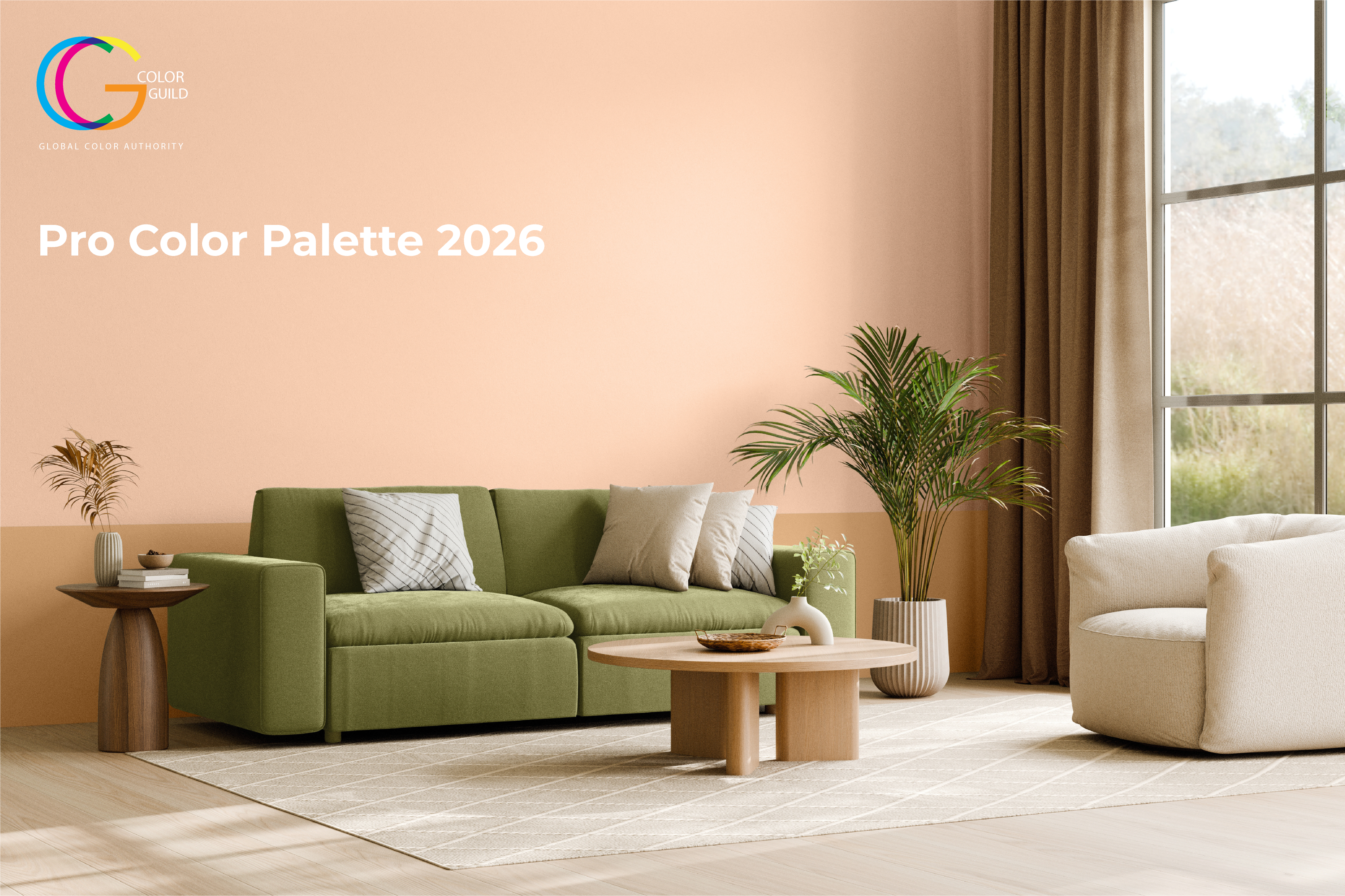
Residential
Classic residential colors are reimagined with greater nuance and clarity. Traditional blues shift towards green-tinted hues Luna Light and Bowman Blue, while fresh white Sugar Dust and clean Mineral Glow introduce a sense of refined brightness. Smoky gray Subtle Shadow and charcoal black Subway add graphic contrast.
There’s an intentional restraint here, an interplay between crisp lightness and deeper grounding notes. The result is a quietly confident palette that offers simplicity without sterility, and elegance without excess.
Hospitality
In today’s fast-paced world, hospitality spaces are expected to deliver calm and sophistication. Designed for upscale interiors, this scheme communicates subtle luxury and contemporary poise.
The palette shifts between brightness and depth with ease, luminous white Sugar Dust adds freshness, while purple-cast grays Calamities and Tin Man offer gentle depth. Mineral Glow brings a touch of warmth, and shaded hues Subtle Shadow and Subway ground the palette with confident structure.
Education
In spaces dedicated to learning and discovery, color must energize and engage. This palette balances vibrancy with structure, using a mostly primary approach to support creativity and encourage participation.
A bright base of Ice Dream contrasts with bold accents Chuckles, Gold Strand and Honky Tonk Blue. Secondary mid-tones, Wildness Mint and Safari Sun add versatility. Together, these hues build a scheme that feels energetic, fun and functionally adaptable.
Offices
As businesses look to bring people back into the office, color is being used to create spaces that feel energizing and distinct from the home. This palette introduces more defined tones to support clarity and focus, while still drawing on nature for warmth and familiarity.
Green-tinted white Ice Dream and verdant Wildness Mint bring a refreshing note, while warm neutrals Green Gold and Terra Pin ground the palette. Accents of sunny Gold Strand and bold Honky Tonk Blue offer focus and energy.
Color Tools & Resources
The Pro Color Palette 2026 is ready to work for your projects. Explore our full range of tools to help you bring these palettes to life — from digital color resources that simplify palette planning to in-store guidance from our expert team. Ready to see a shade in person? Order a color sample today and experience the difference color makes.